What is ChartsXBlock?
Contents
What is ChartsXBlock?#
This XBlock allows course creators to implement charts into a course seamlessly, and with a user-friendly interface that simplifies the process.
Currently, the available chart types include area, bar, pie, line, column, and scatter charts. Users can easily populate these charts from a user-configurable table, accommodating both values and sets, depending on the chosen chart type.
The presentation of these charts is made possible through Google Charts, done in the colourful style of material design.
What are the benefits of using ChartsXBlock?#
Visual Data Representation: ChartsXBlock allows you to present data in a visually appealing and easy-to-understand manner, making complex information more accessible to learners.
Enhanced Engagement: Visual elements like charts and graphs can increase learner engagement by making the content more interactive and engaging.
Data Analysis: It enables learners to analyze data patterns, trends, and relationships, promoting a deeper understanding of the subject matter.
Customization: ChartsXBlock typically offers options for customization, allowing instructors to tailor the charts to their specific educational needs and design preferences.
How to implement ChartsXBlock?#
- Step 1:
Go to Studio. Remember, you can access it through the link in your ECC account or by going to studio.edunext.co and signing in with your email and password.
- Step 2:
Open the course where you will add the ChartsXBlock.
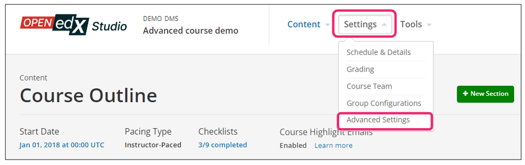
- Step 3:
Click on the Settings tab and select the Advanced Settings option.
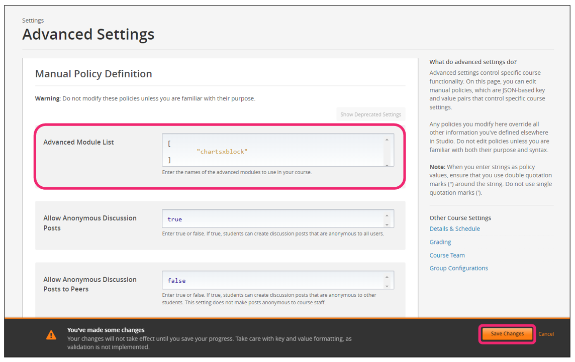
- Step 4:
In the section Advanced Module List, add
chartsxblockbetween the square brackets.[ "chartsxblock" ]
Note
Add the XBlock command with an indented space without any space before or after quotation marks, as shown in the example above, to avoid execution errors.
- Step 5:
At the bottom of the screen, click on Save Changes.
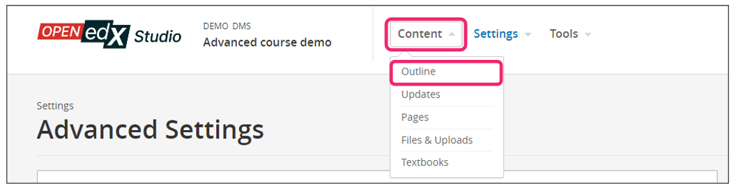
- Step 6:
After this, the XBlock should be available, so click the Content tab and select the Outline option to get back to the course content.
- Step 7:
Under Outline, go to the section, then the subsection, and finally to the unit or page where you want to add the ChartsXBlock.
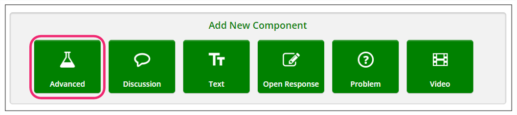
- Step 8:
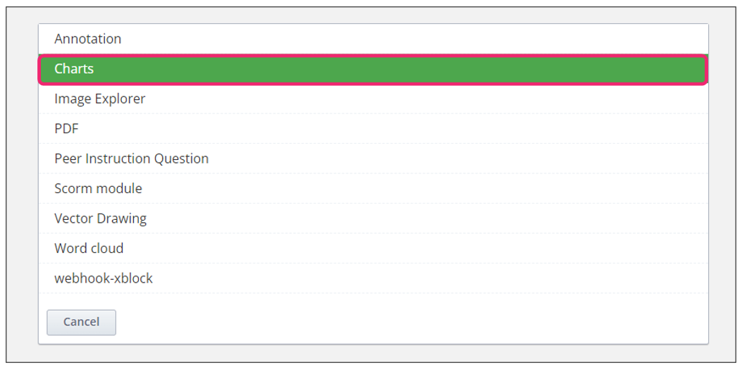
Once you are there, click Advanced Component in the Add New Component bar.
- Step 9:
You will see a list of all the advanced components added to your course. Click on Charts. The system will add the component immediately to the unit.
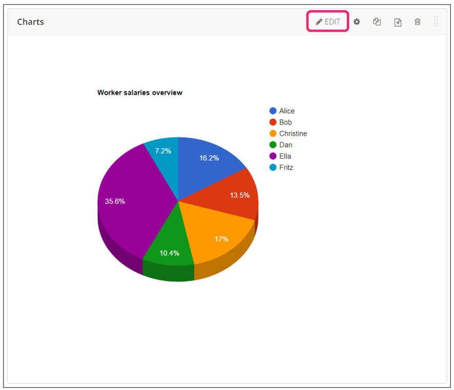
- Step 10:
Click the Edit option to configure the XBlock as needed.
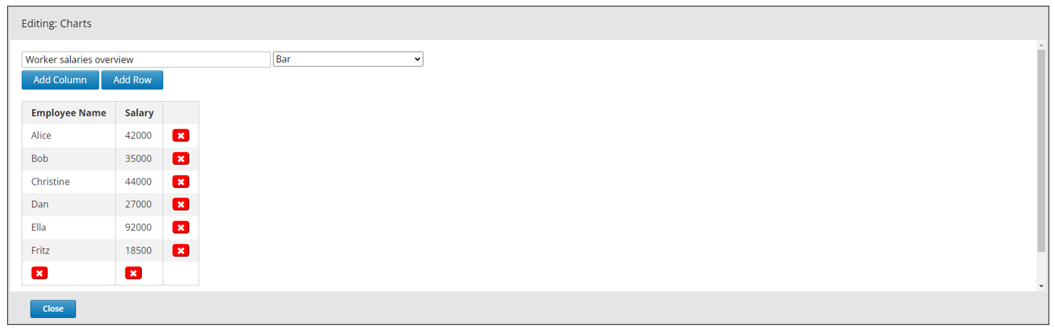
- Step 11:
The editor window is going to open. The options you will see and configure here are:
Chart name
Chart type
Add column
Add row
Delete column
Delete row
Update button
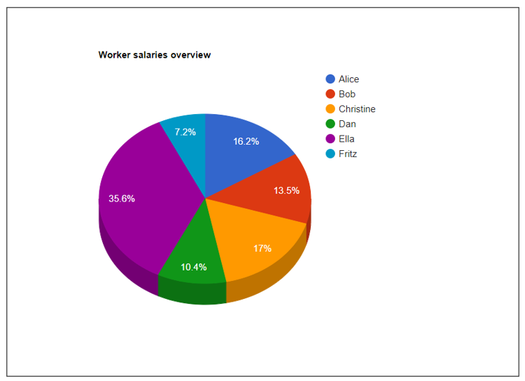
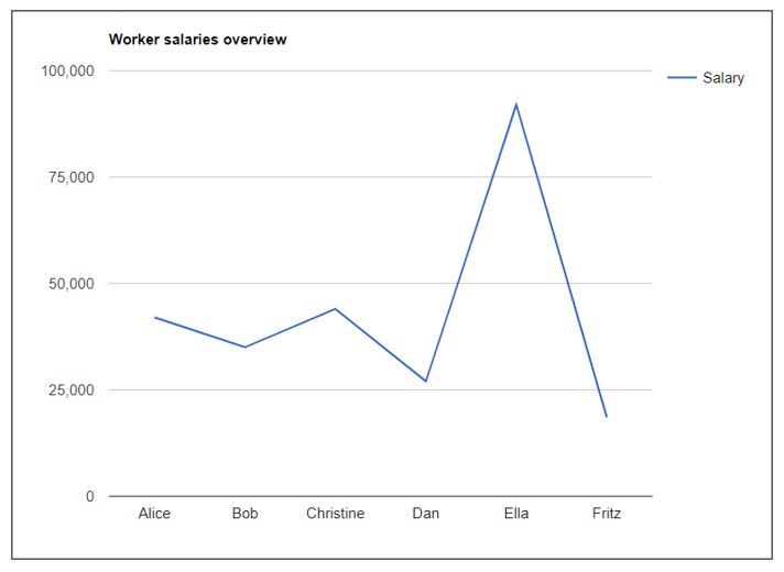
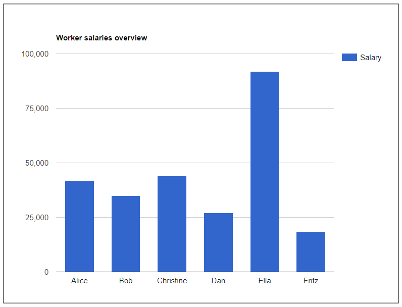
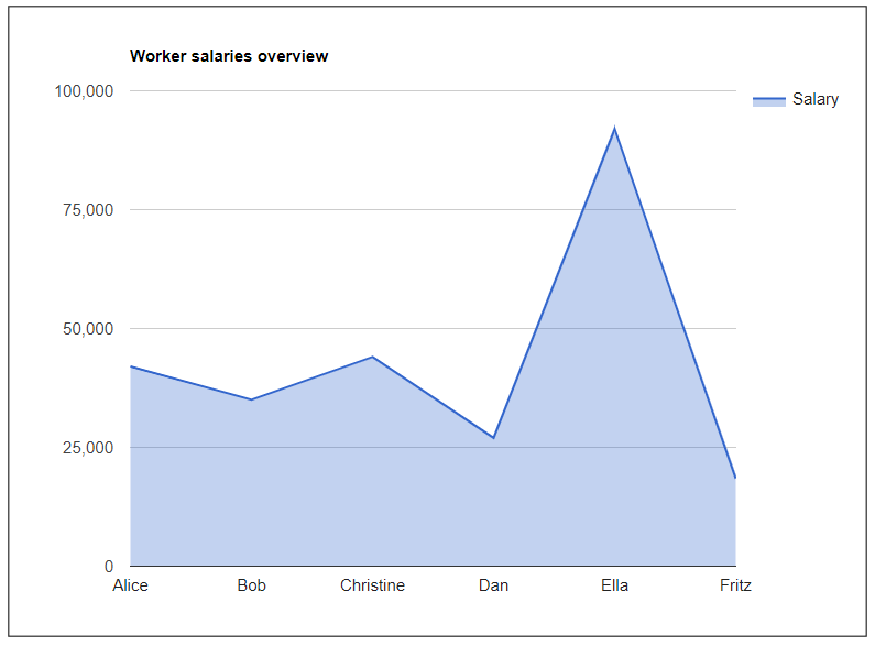
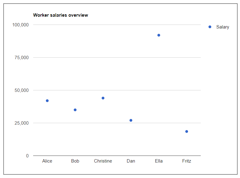
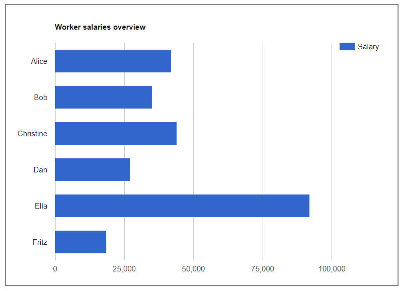
Below is an overview of all chart types in the XBlock. These charts contain the same data in every instance, which is the default populated values.
Pie Chart
Line Chart
Column Chart
Area Chart
Scatter Chart
Bar Chart
- Step 12:
Finish the configuration of the component and click on the Update then Close button at the bottom.
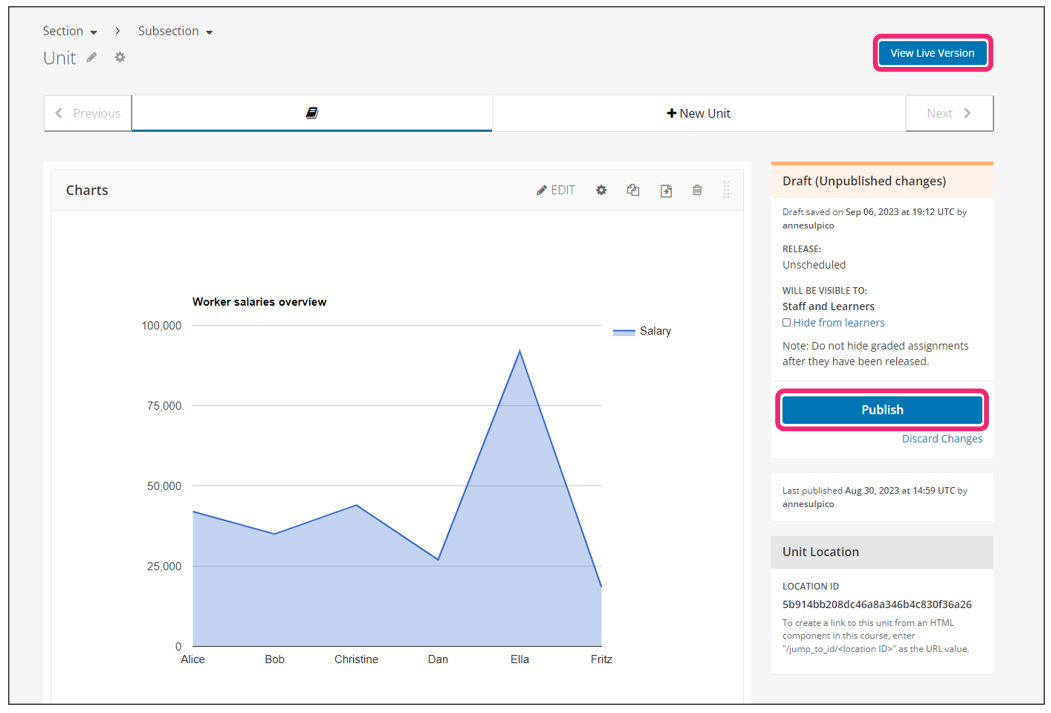
- Step 13:
Publish the unit and check how your new component looks on its final version by clicking the View Live Version button.
See also
You may also visit our demo site where you can find various examples of the use of the ChartsXBlock.