What is an Image Modal XBlock?
Contents
What is an Image Modal XBlock?#
The Image Modal XBlock is a valuable feature that empowers users to explore images with greater clarity and detail. It proves especially handy when dealing with large, intricately detailed images. Here is a breakdown of how it functions and the advantages it offers:
Activation: Users initiate the image modal by interacting with an image, often through a click. Initially, a resized version of the image appears on the webpage, providing a glimpse of its content.
Full-Screen View: However, the magic happens when users click on this resized image. Doing so triggers the opening of a full-screen modal. Within this modal, users are presented with the full-size version of the image, allowing for a much closer examination.
What are the benefits of using an Image Modal XBlock?#
Collaborative Learning: The primary benefit of the image modal is the ability to examine images meticulously. This is especially useful when dealing with images containing intricate details that might be overlooked in their smaller counterparts.
Personalized Learning Pathways: The modal is intuitive design ensures that users can easily access the full-size image, making it a user-friendly tool for all levels of digital proficiency.
Quality Assurance and Engagement: By displaying the full-size image within a pop-up modal, space on the webpage is efficiently utilized. This is particularly advantageous when dealing with limited screen real estate.
How to implement an Image Modal XBlock?#
- Step 1:
Go to Studio. Remember, you can access it through the link in your ECC account or by going to studio.edunext.co and signing in with your email and password.
- Step 2:
Open the course where you will add the Image Modal XBlock.
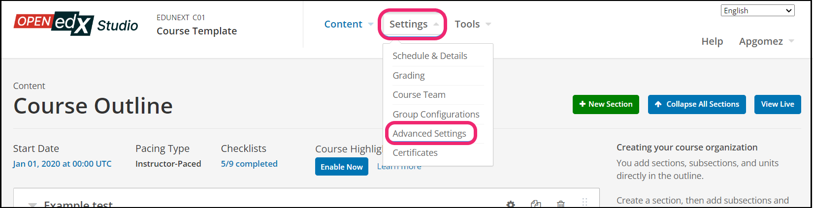
- Step 3:
Click on the Settings tab and select the Advanced Settings option.
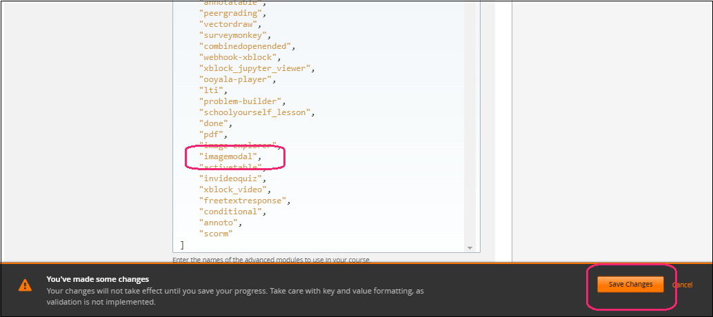
- Step 4:
In the section Advanced Module List, add
imagemodalbetween the square brackets.[ "imagemodal" ]
Note
Add the XBlock command with an indented space and without any space before or after quotation marks, as shown in the example above, to avoid execution errors.
- Step 5:
At the button on the screen, click on Save Changes.
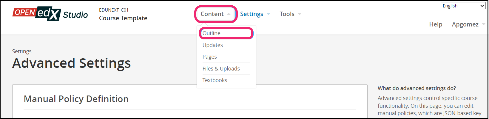
- Step 6:
After this, the XBlock should be available, so click the Content tab and select the Outline option to get back to the course content.
- Step 7:
Under Outline, go to the section, then the subsection, and finally to the unit or page where you want to add the Image Modal XBlock.
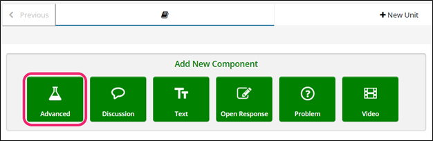
- Step 8:
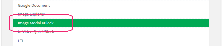
Once you are there, click Advanced Component in the Add New Component bar.
- Step 9:
You will see a list of all the advanced components added to your course. Click on Image Modal XBlock. The system will add the component immediately to the unit.
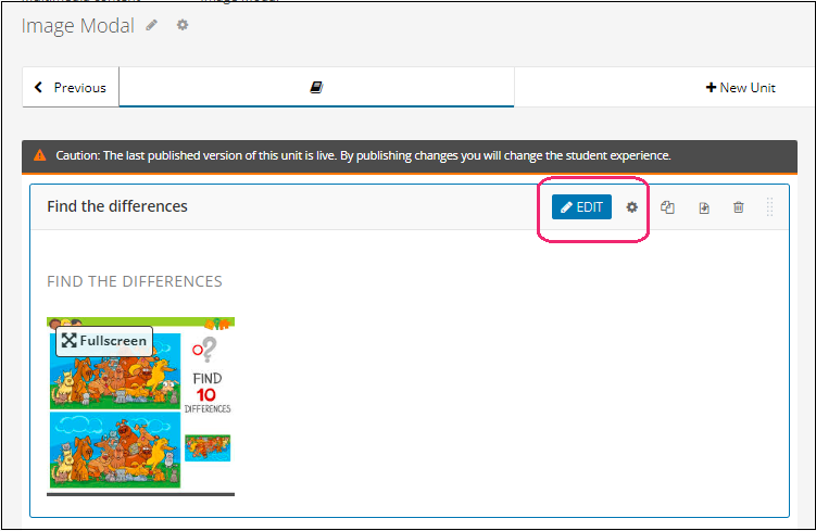
- Step 10:
Click the Edit button on the upper right corner of the new component to add the content details.
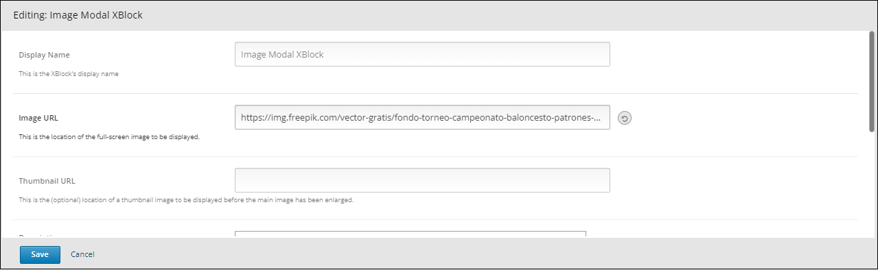
- Step 11:
The editor window is going to open. Here you will find several options to set up the XBlock as needed. The principal options that you have to edit are:
Display Name: Set the XBlock’s display name.
Image URL: In this location insert the URL of the image you would like to have displayed.
Thumbnail URL: This is the (optional) location of a thumbnail image to be displayed before the main image has been enlarged.
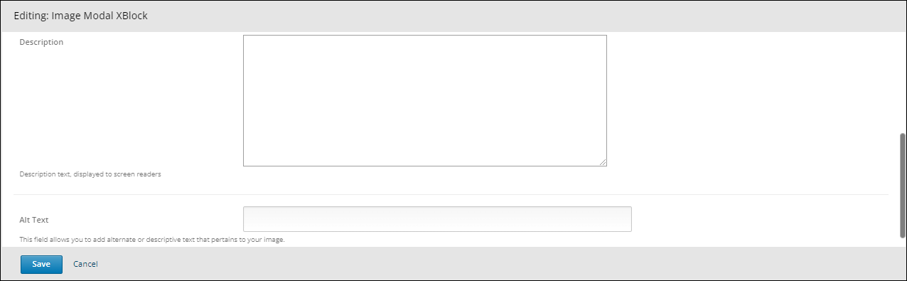
Description: Description text, made accessible for screen readers.
Alt Text: This field allows you to add alternate or descriptive text that pertains to your image.
- Step 12:
Finish the configuration of the component and click on the Save button.
- Step 13:
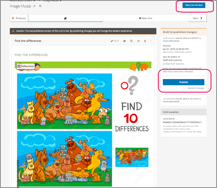
Publish the unit and check how your new component looks on its final version by clicking the View Live Version button.
You may also visit our demo site where you can find various examples of the use of the Image Modal XBlock.